Color Guide for Musicians: Pick the Perfect Hues for Your Sound
Ever wonder why some albums grab you as soon as you see them? It’s often the color. The right shade can make a track feel brighter, darker, or more energetic before you even press play. In this guide we’ll break down why color matters and give you easy steps to pick colors that match your music.
Why Color Matters in Music
Our brains link colors to emotions automatically. A neon green vibe feels fresh and modern, while deep red can feel intense or nostalgic. When you pair the right hue with a song or a set, you’re giving listeners a visual cue that reinforces the mood. That’s why big artists spend weeks designing album covers and stage lighting – they’re not just being flashy, they’re shaping the listener’s experience.
Think about the last playlist you opened on a streaming service. The cover art, the background theme, even the type of font all work together to tell a story. If the visuals clash with the music, the story feels off. Matching colors helps create a consistent brand, making it easier for fans to recognize your work at a glance.
Practical Tips for Choosing Colors
1. Start with the song’s mood. Ask yourself: Is the track upbeat or chill? Does it tell a personal story or a party anthem? Use warm colors (red, orange, yellow) for energetic tracks and cool colors (blue, teal, violet) for calmer vibes.
2. Keep it simple. One dominant color plus a neutral accent works better than a rainbow of shades. Too many colors can distract from the music itself.
3. Look at genre conventions. Rock often leans toward darker tones, EDM favors bright neon palettes, folk tends to use earthy browns and greens. You can follow the trend or flip it for a fresh look.
4. Test with your audience. Share a few mock‑up covers on social media and watch the reactions. The comments will tell you if a color feels right or out of place.
5. Use tools. Online color pickers like Adobe Color or Coolors let you generate harmonious palettes in seconds. Plug in a base color and see complementary shades that won’t clash.
6. Apply consistently. Use the same palette for your social posts, merch, and stage lighting. Consistency builds a visual signature that fans can tie to your sound.
When you’re setting up stage lights, think about the song flow. Start a ballad with soft blues, then switch to electric orange for the chorus drop. The visual shift amplifies the musical shift, keeping the crowd engaged.
Finally, don’t be afraid to experiment. Some of the most memorable album covers broke the rules – think of a completely black cover for a bright pop album. If it feels authentic to your music, it’ll likely resonate with listeners.
Bottom line: color is a shortcut to emotion. Use it wisely, keep it simple, and let it echo the feelings in your music. Your fans will notice the harmony between what they see and what they hear, and that’s how you turn a good track into a memorable brand.
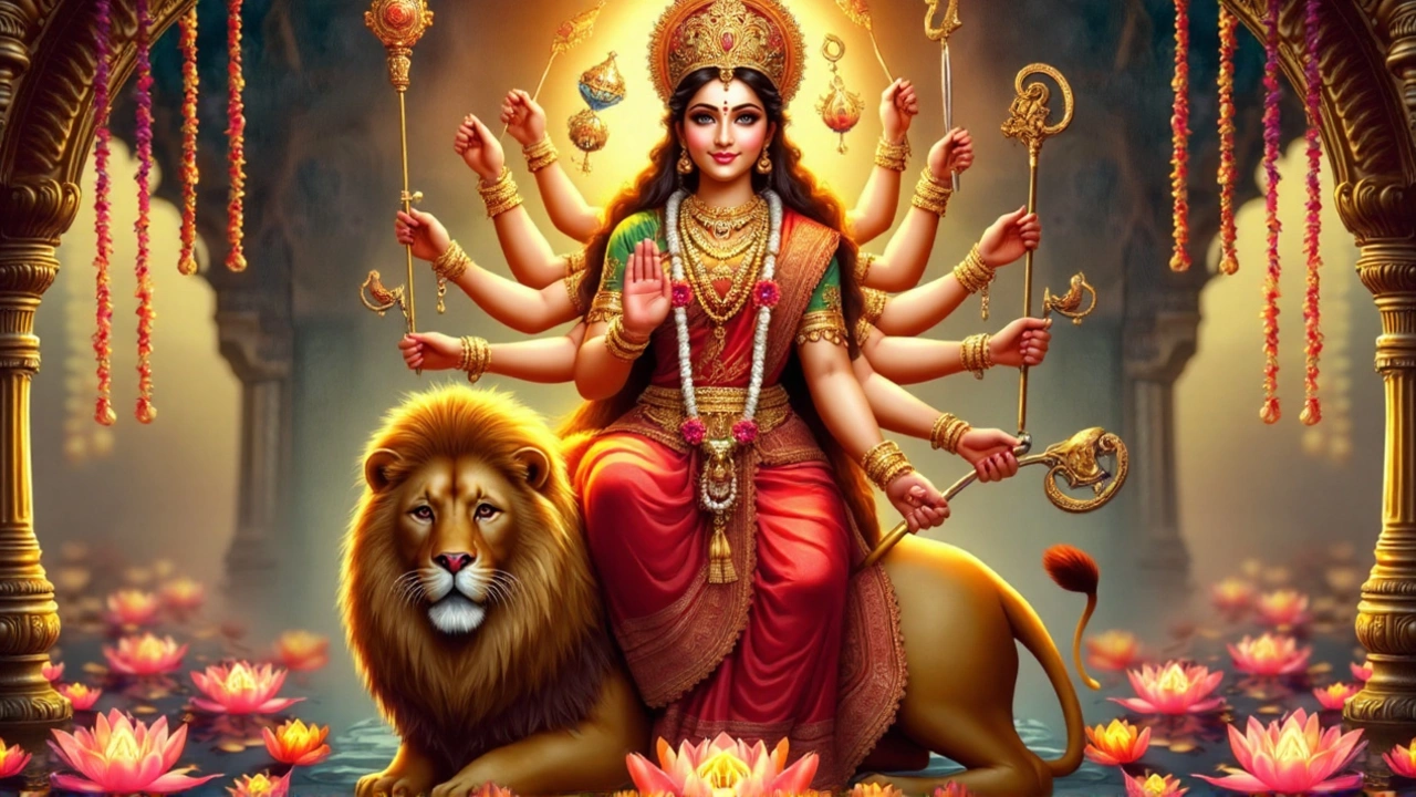
Navratri 2024 runs from October 3 to October 12, with each of the nine days dedicated to a different form of Goddess Durga. Tradition pairs every day with a specific color – from bright yellow on day 1 to royal purple on day 9. Each hue reflects the deity’s attributes and is believed to boost devotees’ spiritual connection. Wearing the right color is thought to invite prosperity, peace and inner strength. This guide details the colors, their symbolism and the benefits of observing the practice.
Read more


